An AI-native path from raw data to decisions
FactWeavers is an AI-powered decision intelligence platform that transforms raw data into structured metrics, dashboards, and actionable insights. Teams onboard data sources, define metrics, and convert them into dynamic dashboards tracking performance across yearly, monthly, weekly, and real-time views will shared across internal teams and external clients.
At its core, an AI layer lets users interact with their data conversationally, asking questions, generating insights, and exploring predictive trends. Beyond visualization, the platform supports goal and target setting at the metric level.
While functionally robust, the experience lacked cohesion; workflows from onboarding to insight generation were fragmented, and AI wasn't deeply embedded into decision-making. This project focused on transforming FactWeavers into a unified, AI-native system.
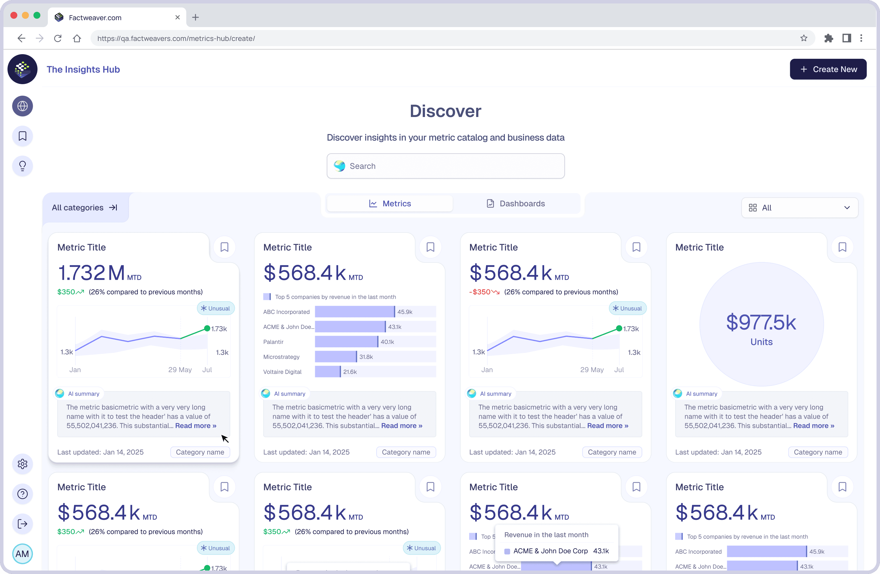
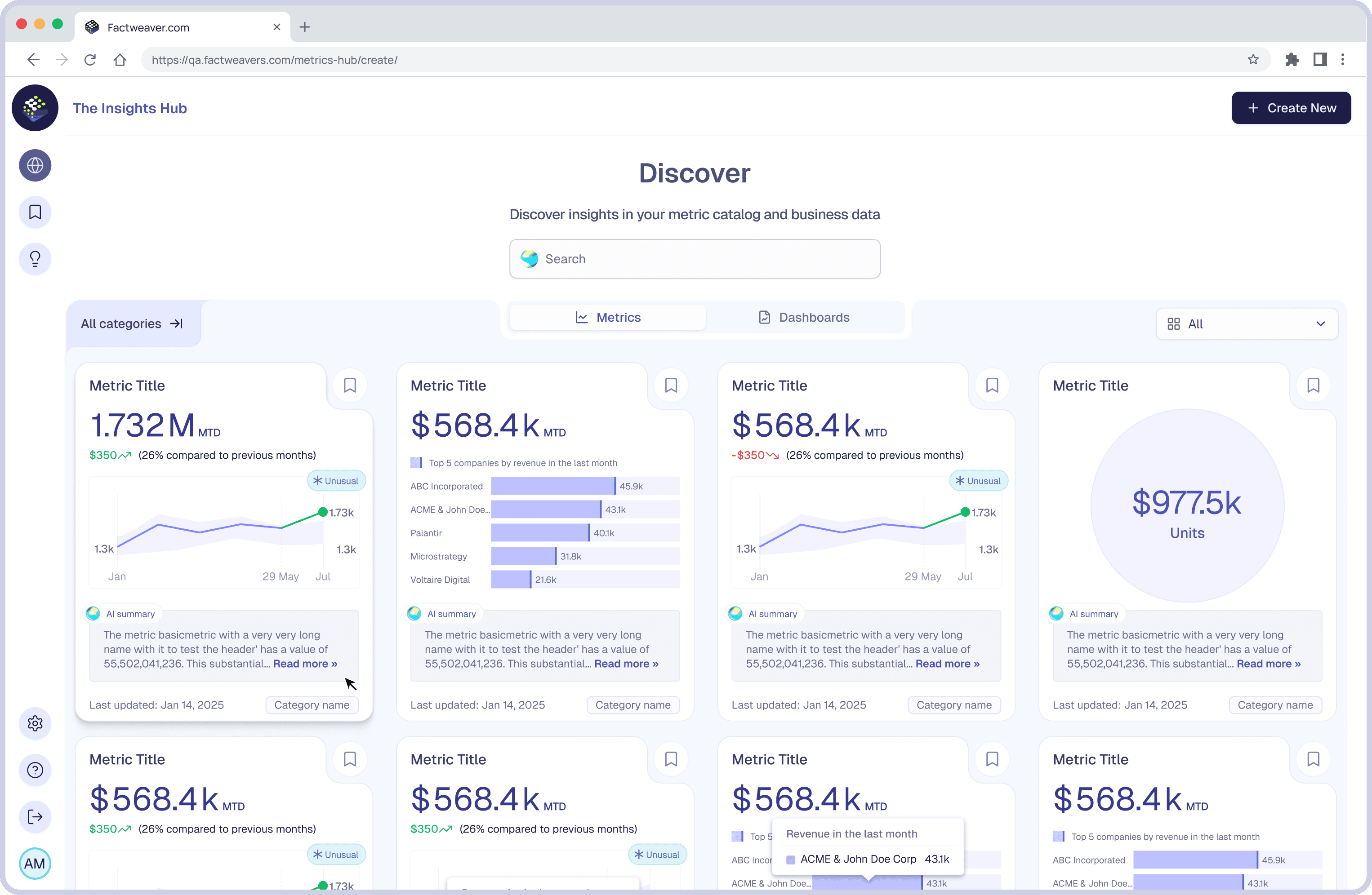
Discover the entry point where users browse the existing metric and dashboard catalog before creating something new.
What I owned, on a four-designer team
Not everything on this page was mine alone. Here's exactly where I held the pen and where I worked in support of the wider team.
Product discovery
Worked with the founder, product owners, and principal designer to translate business goals into design requirements and constraints.
UX strategy
Defined the design principles that guided metric creation, AI interaction, and dashboard experience across the platform.
Information architecture
Contributed to restructuring the platform into a modular onboard → define → visualize → share flow, alongside the principal designer.
AI experience design
Owned the conversational, AI-assisted metric creation feature end to end, from interaction model to explainability pattern.
Dashboard experience
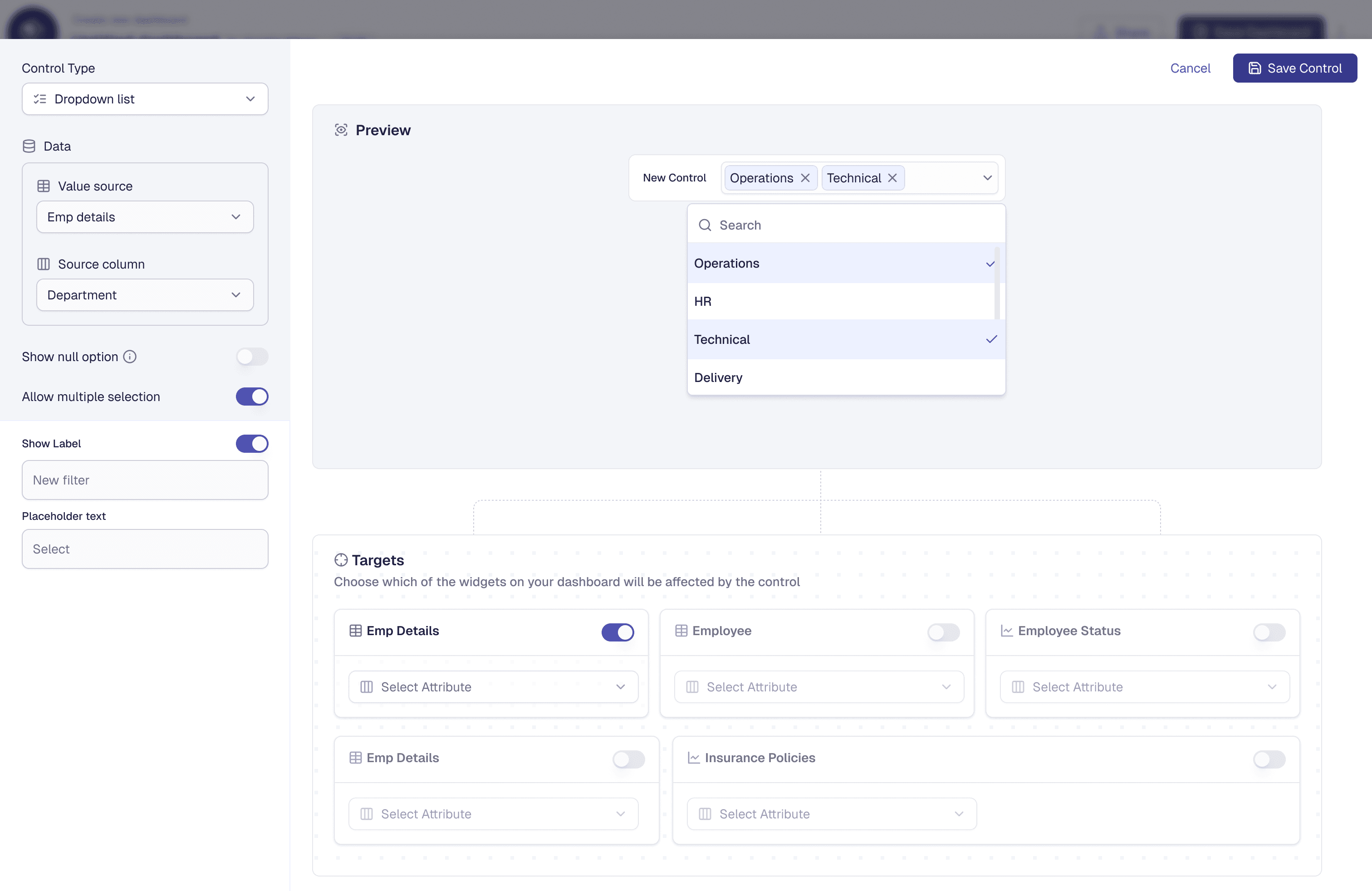
Owned dashboard customization and the real-time filtering system; dropdowns, text, number, and date-based conditions.
Design systems
Designed dashboard theming and contributed component patterns to the shared system layer; cards, charts, and role-based states.
Cross-functional collaboration
Worked closely with product, engineering, and data teams throughout to ensure feasibility of AI-driven workflows.
Developer handoff
Documented interaction states, permission logic, and component behavior for engineering handoff on owned workflows.
Technically capable. Not seamless, not trustworthy.
The platform failed to deliver a cohesive data-to-decision experience. Six structural challenges limited usability, scalability, and adoption.
This wasn't a feature-level problem, it was a system-level challenge involving workflow fragmentation, trust in AI, and enabling fast, independent decision-making.
Where I focused, on a four-designer team
I contributed to key platform workflows, how users create metrics, interact with AI, and customize dashboards.
Product collaboration & requirement definition
Worked with the founder, product owners, and principal designer to align design decisions with business and technical constraints.
Metric creation experience
Enhanced the metric creation flow for basic and composite metrics, simplifying complex configuration.
Conversational metric creation (AI)
Led the design of an AI-driven feature for creating metrics instantly through conversational input.
User onboarding & role-based setup
Designed onboarding that differentiates BI users and admin users for structured organization setup.
Dashboard customization & controls
Built flexible filtering; dropdowns, text, number, and date-based inputs for dashboard views.
Visual design & theming
Designed dashboard themes for visual consistency across data-heavy interfaces.
Cross-functional collaboration
Worked closely with product, engineering, and data teams to ensure feasibility of AI-driven workflows.
Five principles that guided every decision
The platform was technically capable but lacked a cohesive experience. These principles guided metric creation, AI interaction, and dashboard design.
AI must be explainable and actionable
Every AI-generated metric needed to clearly communicate how it was derived, so users could validate outputs and act with confidence.
From metric creation to insight in one flow
I designed a connected workflow so users move seamlessly from defining metrics to generating and visualizing insights.
Enable non-technical users without limiting power
Simplified interactions for business users, while retaining flexibility for advanced configuration.
Progressive disclosure of complexity
Flows reveal complexity progressively, users start simple, and go deeper only when they need to.
Flexible & customizable exploration
Flexible filtering lets users tailor dashboards to their context without breaking system consistency.
AI-assisted metric creation
Generate and configure metrics using natural language and structured workflows, reducing manual setup.
Conversational data exploration
Explore insights, refine queries, and compare outputs through AI-driven interaction.
Flexible dashboard & filtering system
Interactive, real-time filtering turns dashboards into decision-making tools.
Role-based onboarding & access control
Structured, role-aware setup replacing a one-size-fits-all onboarding flow.
A modular system, restructured for clear progression
The existing platform had fragmented workflows and flows that assumed technical expertise. I restructured it into stages that reduce context switching.
A shared system layer; design system, themes, charts, and permissions runs beneath all four stages, ensuring consistency, scalability, and alignment across every workflow.
From data setup to insight, with minimal friction
Balancing guided experiences for non-technical users with flexibility for advanced ones.
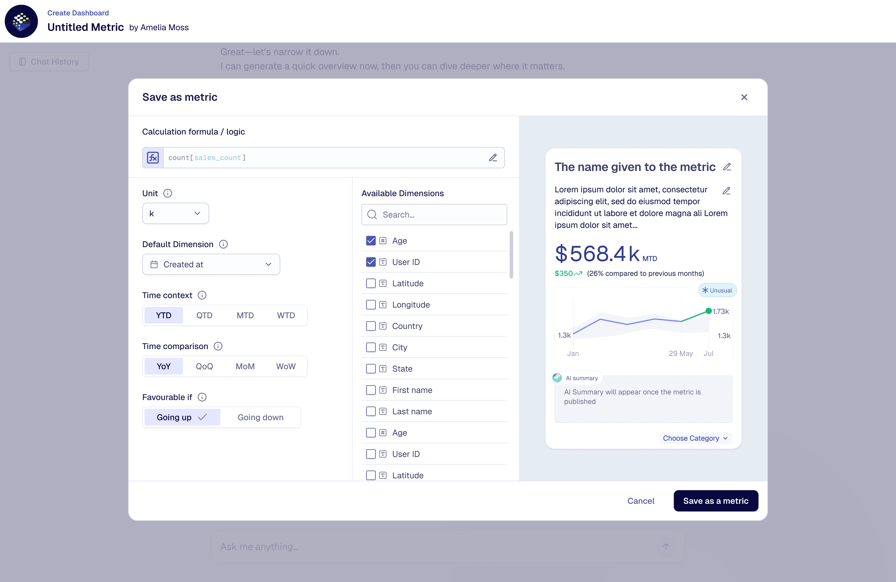
Defining metrics & generating insights
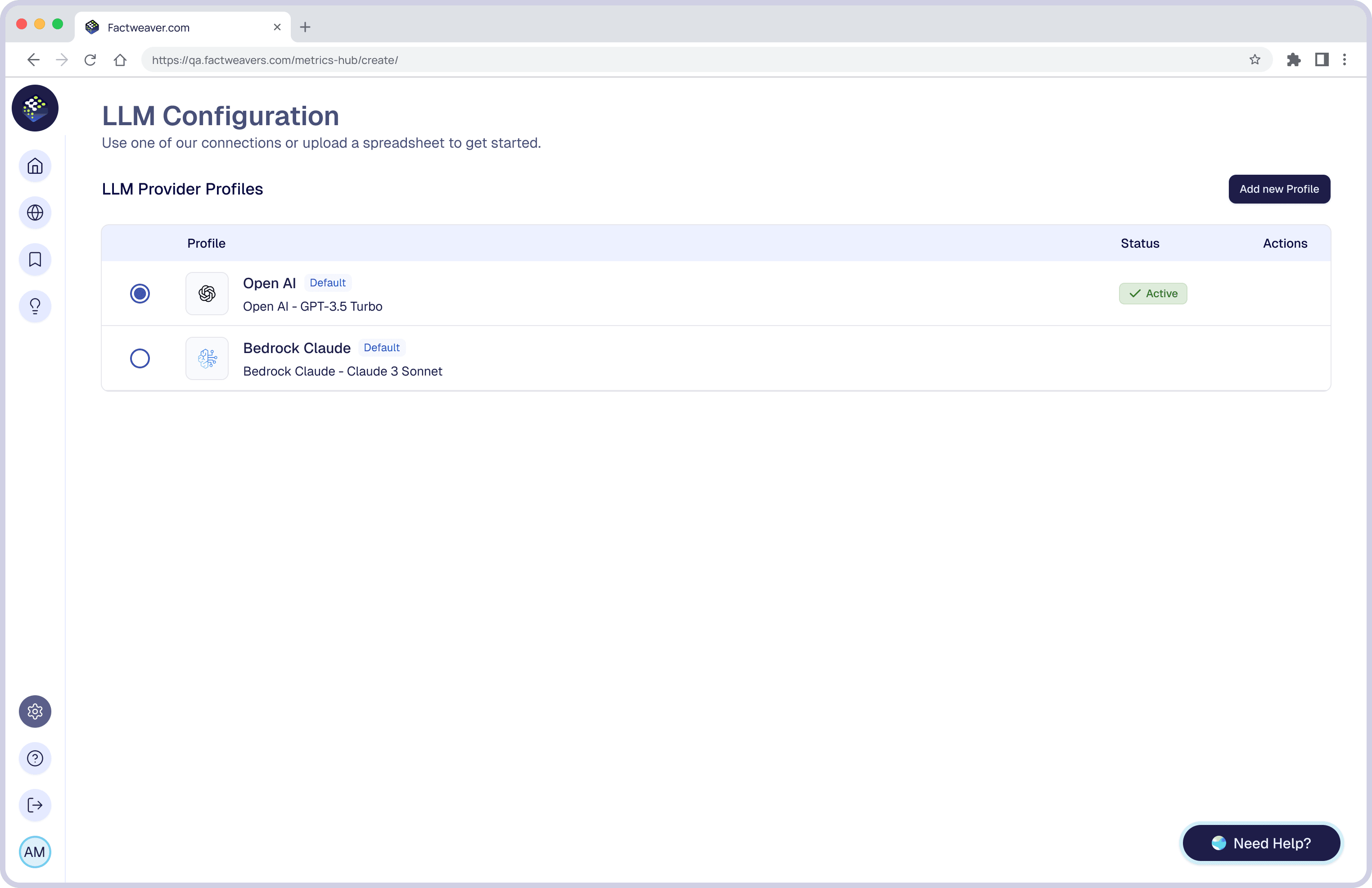
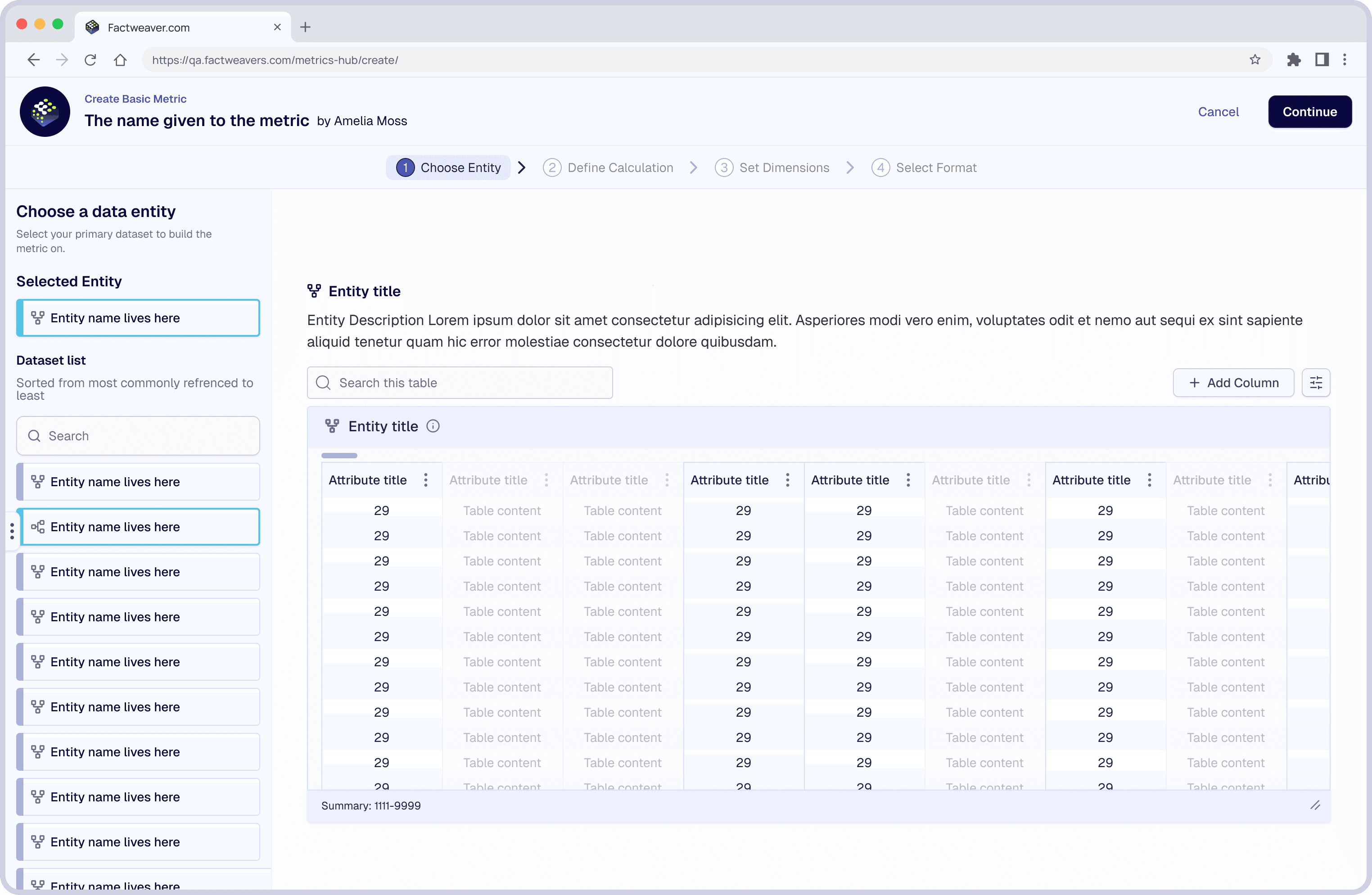
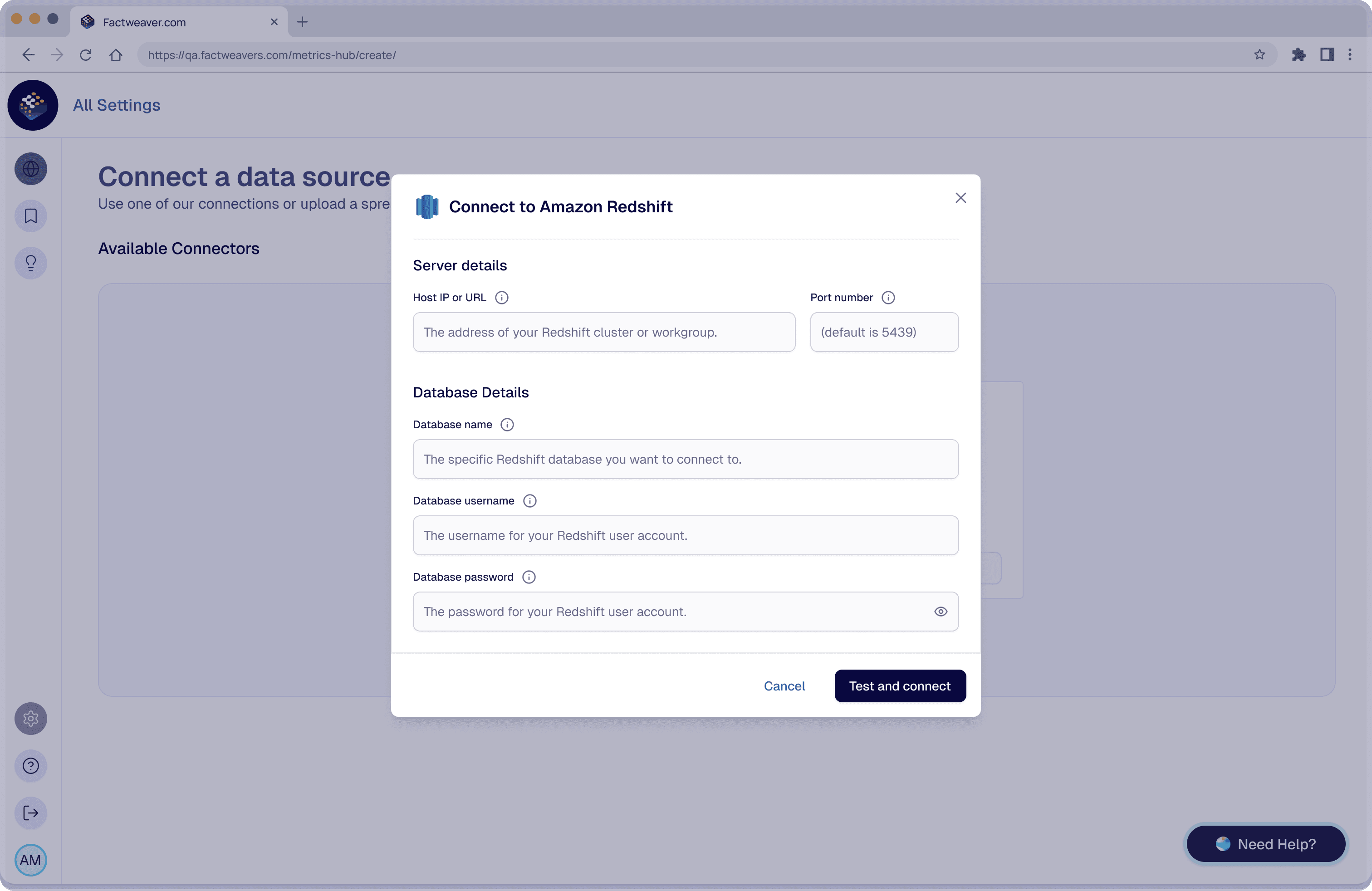
Metric creation was one of the most complex and critical parts of the platform, often requiring multiple configuration steps and technical understanding. I redesigned it to support both structured configuration and AI-assisted creation.
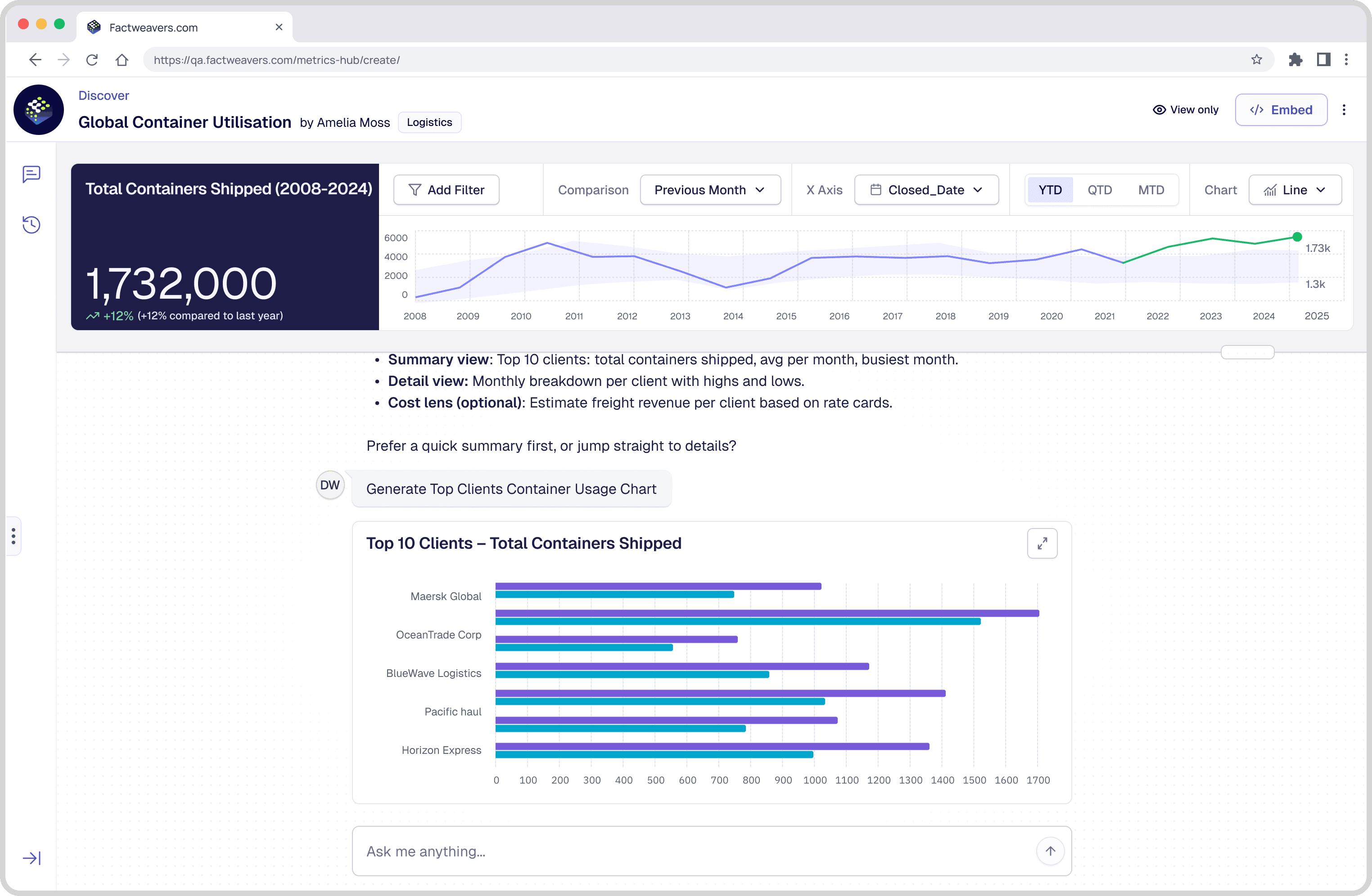
Exploring data with AI
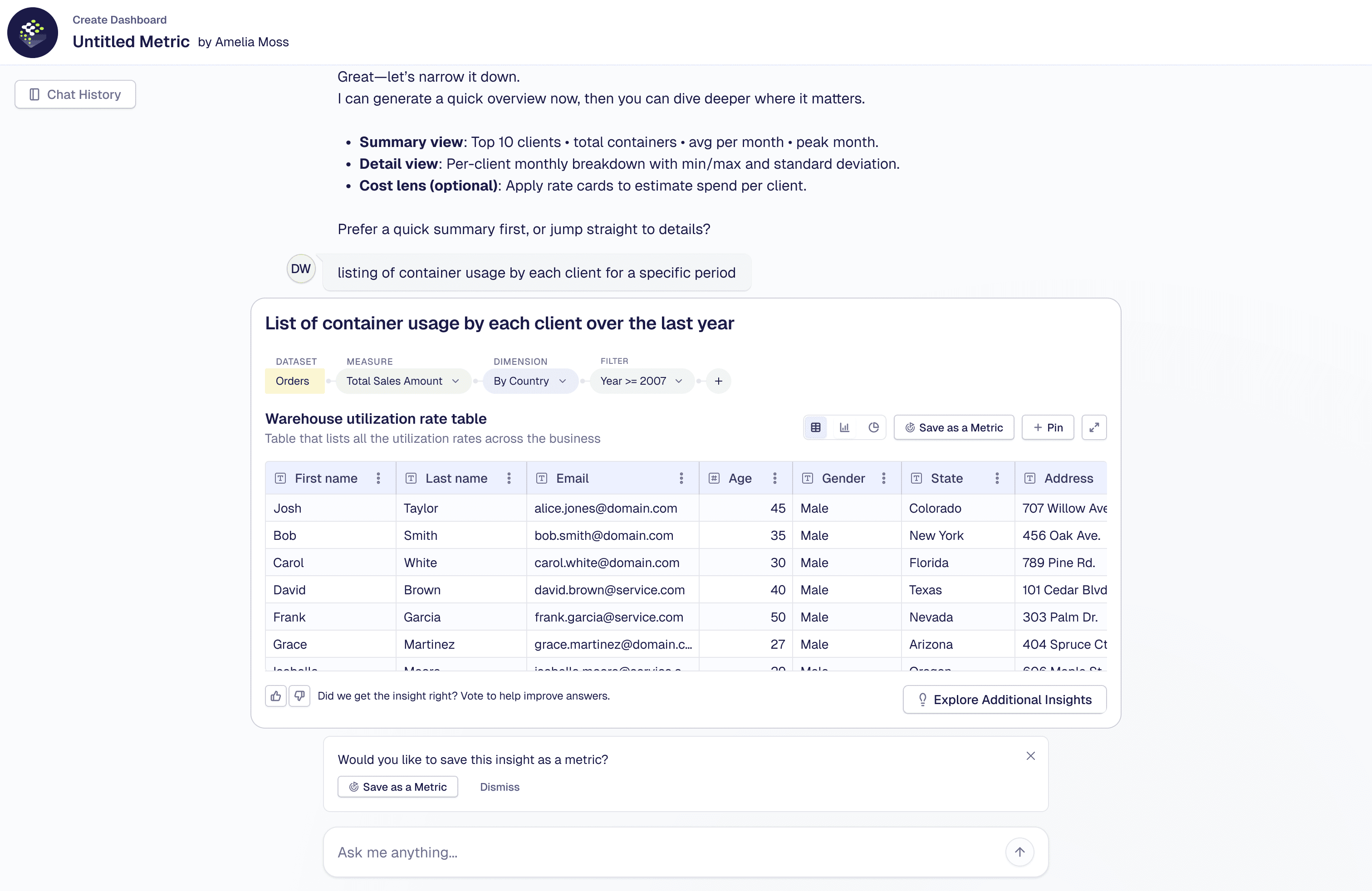
AI interactions were designed to enable intuitive data exploration, users interact with existing metrics through a conversational interface, shifting the experience from static dashboards to interactive decision-making.
Building & customizing dashboards
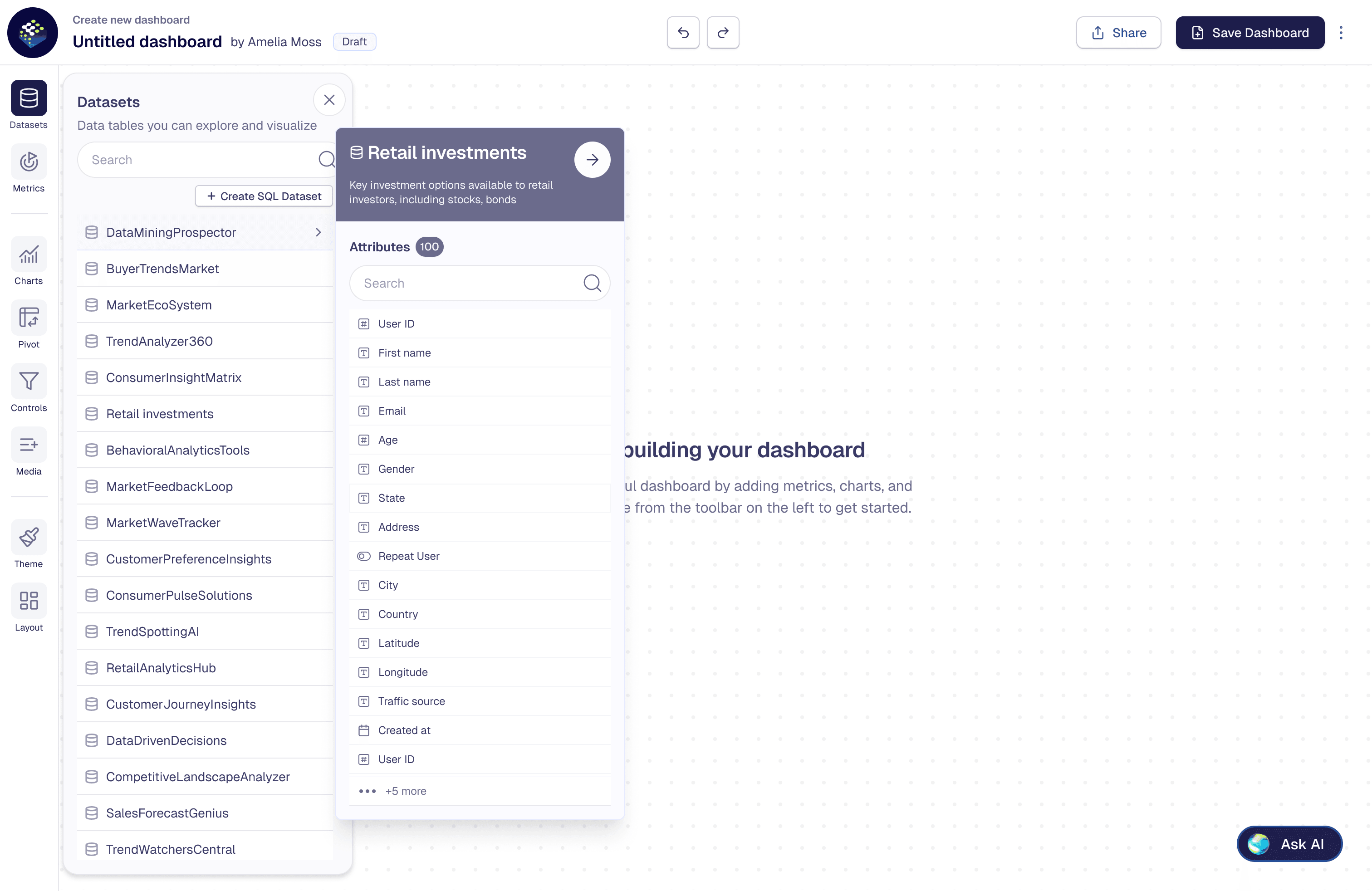
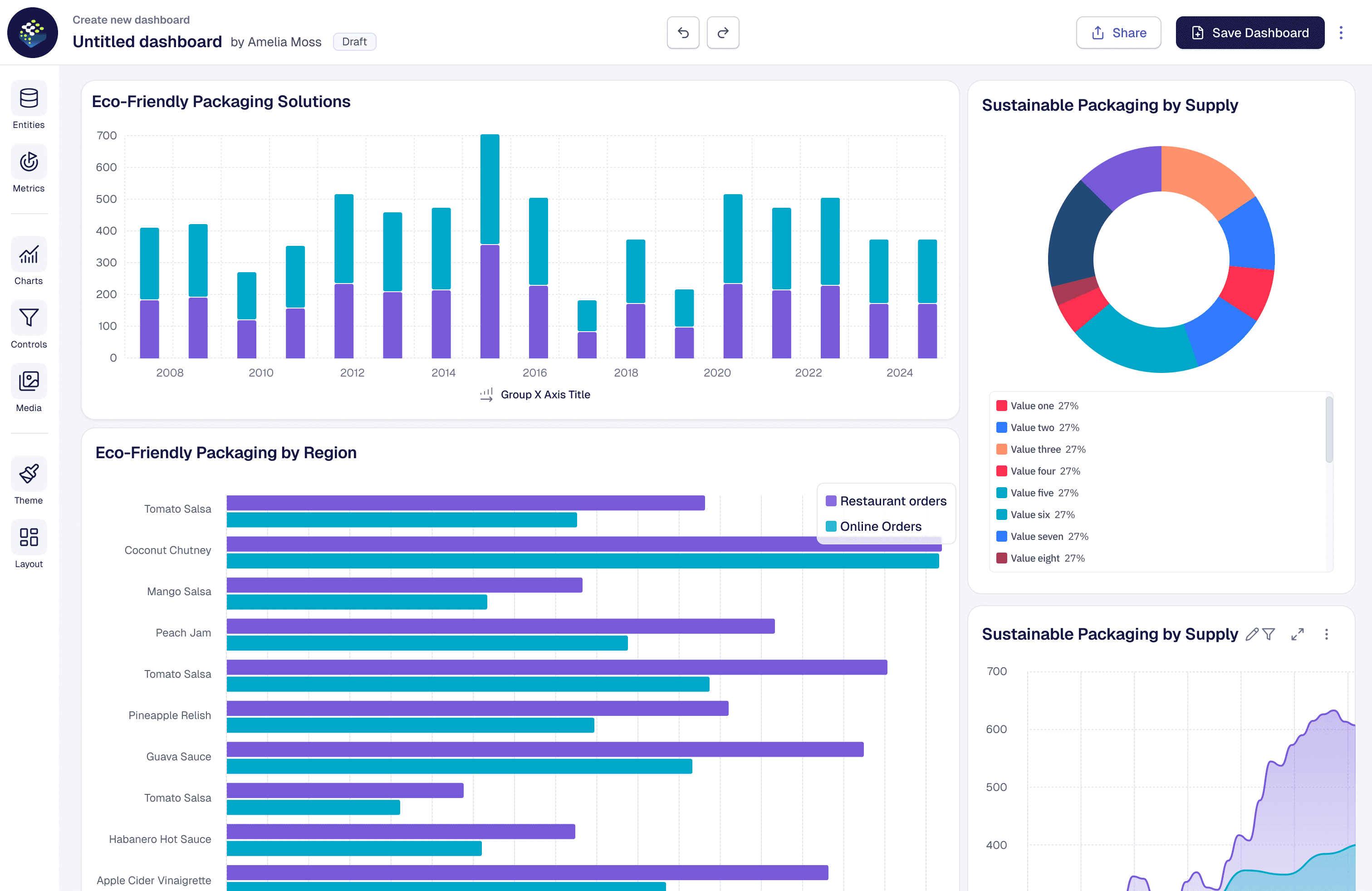
Dashboard creation was redesigned to support flexible visualization and real-time customization.Users build with predefined components and refine views through dynamic filtering.
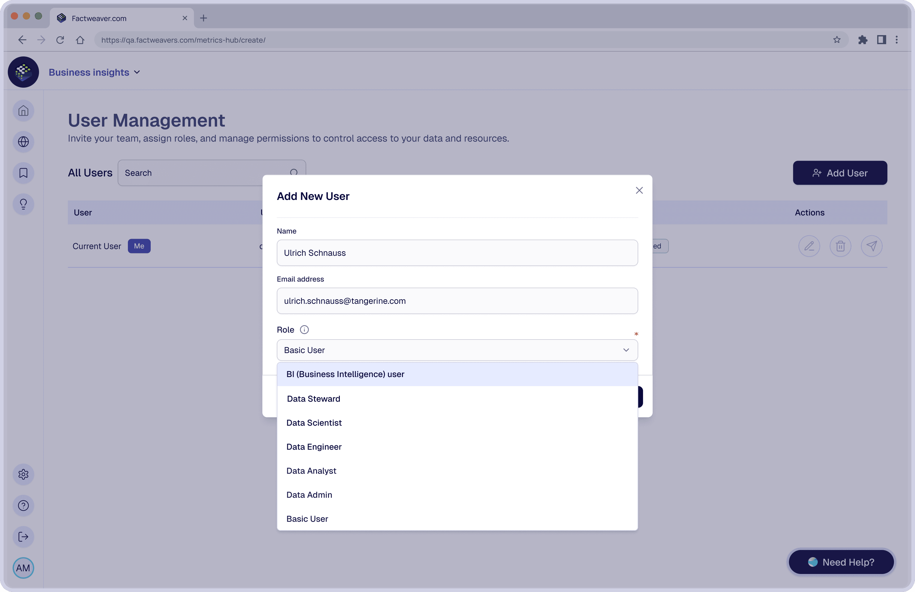
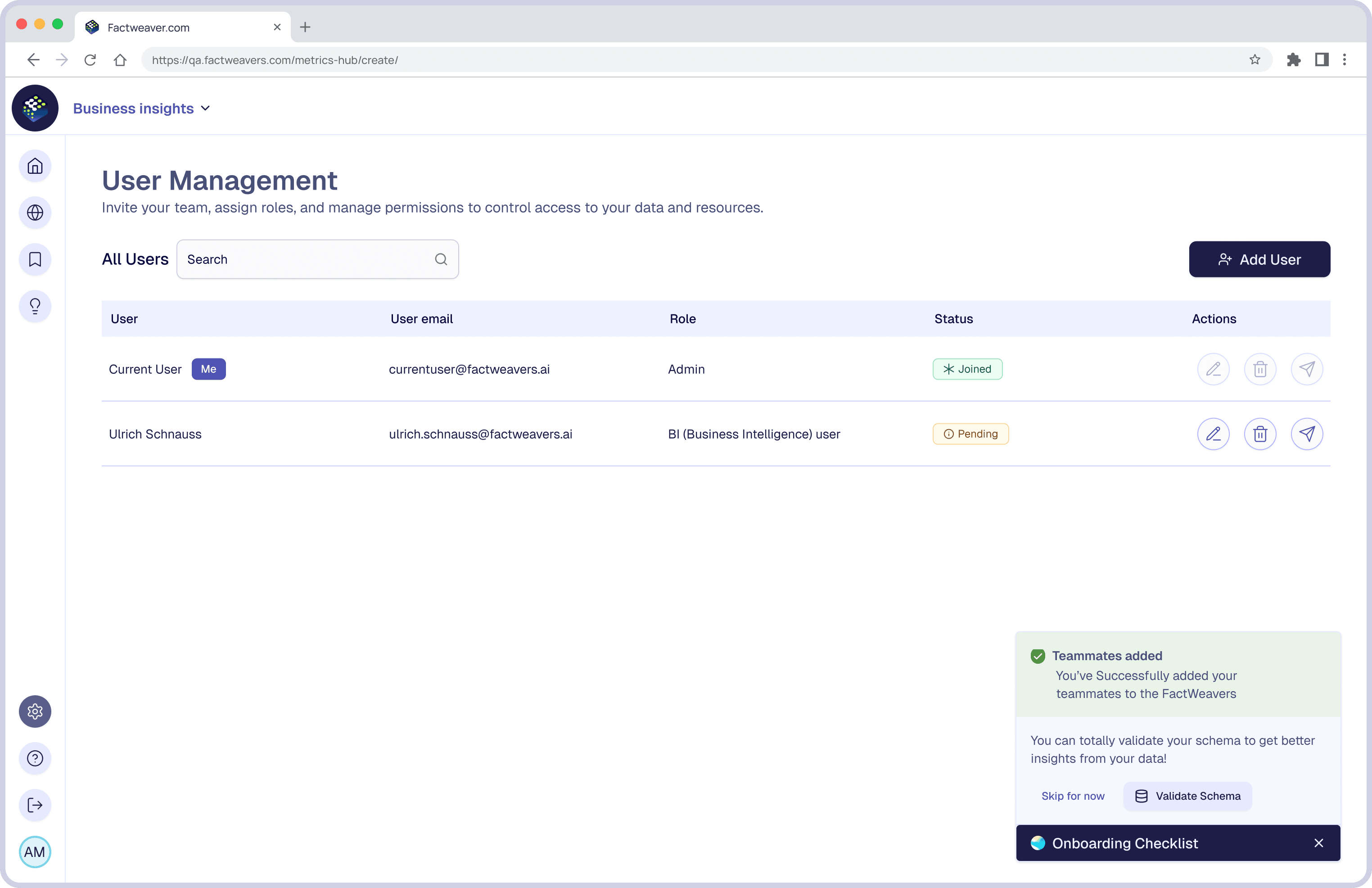
User onboarding & role-based setup
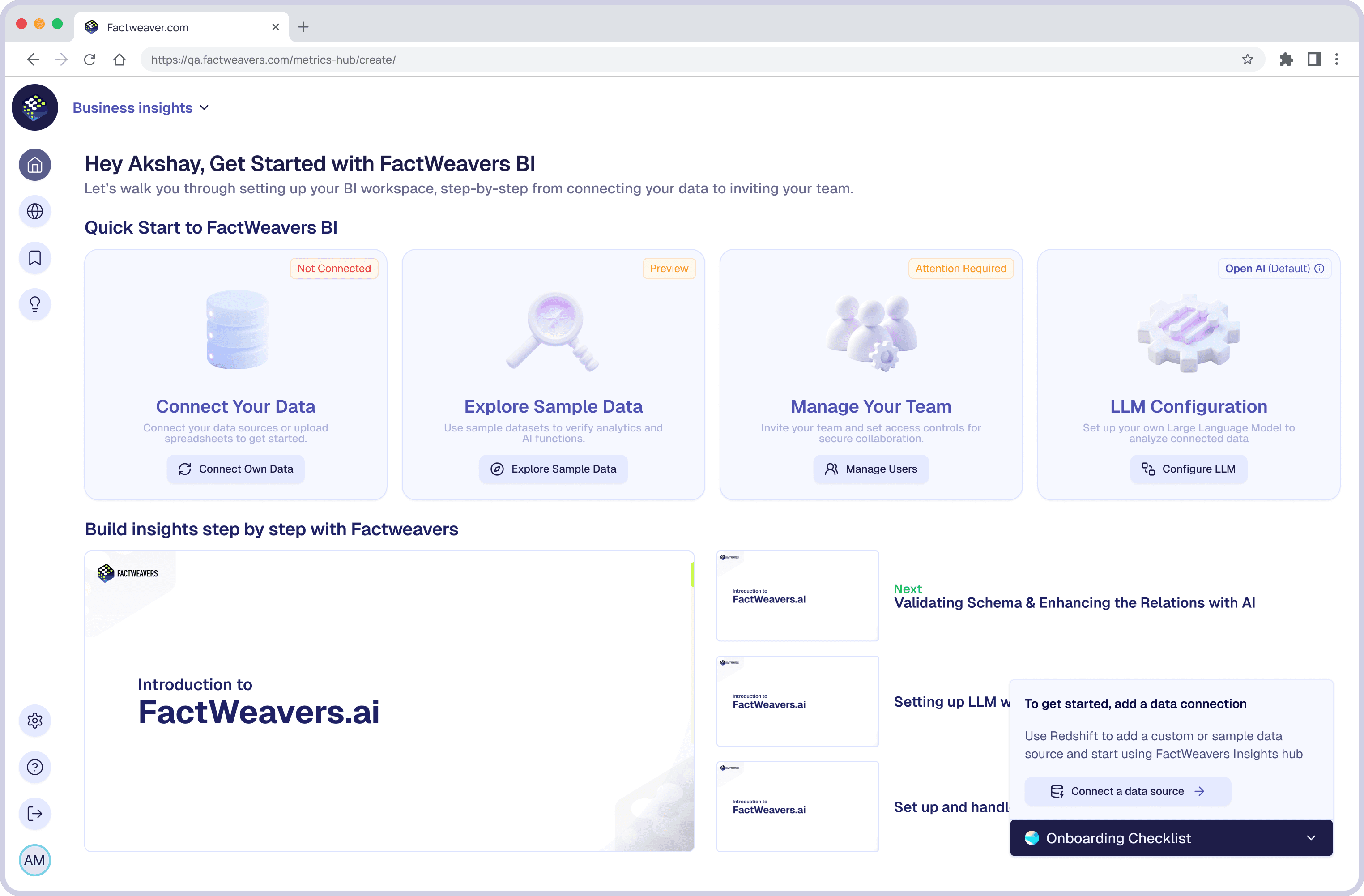
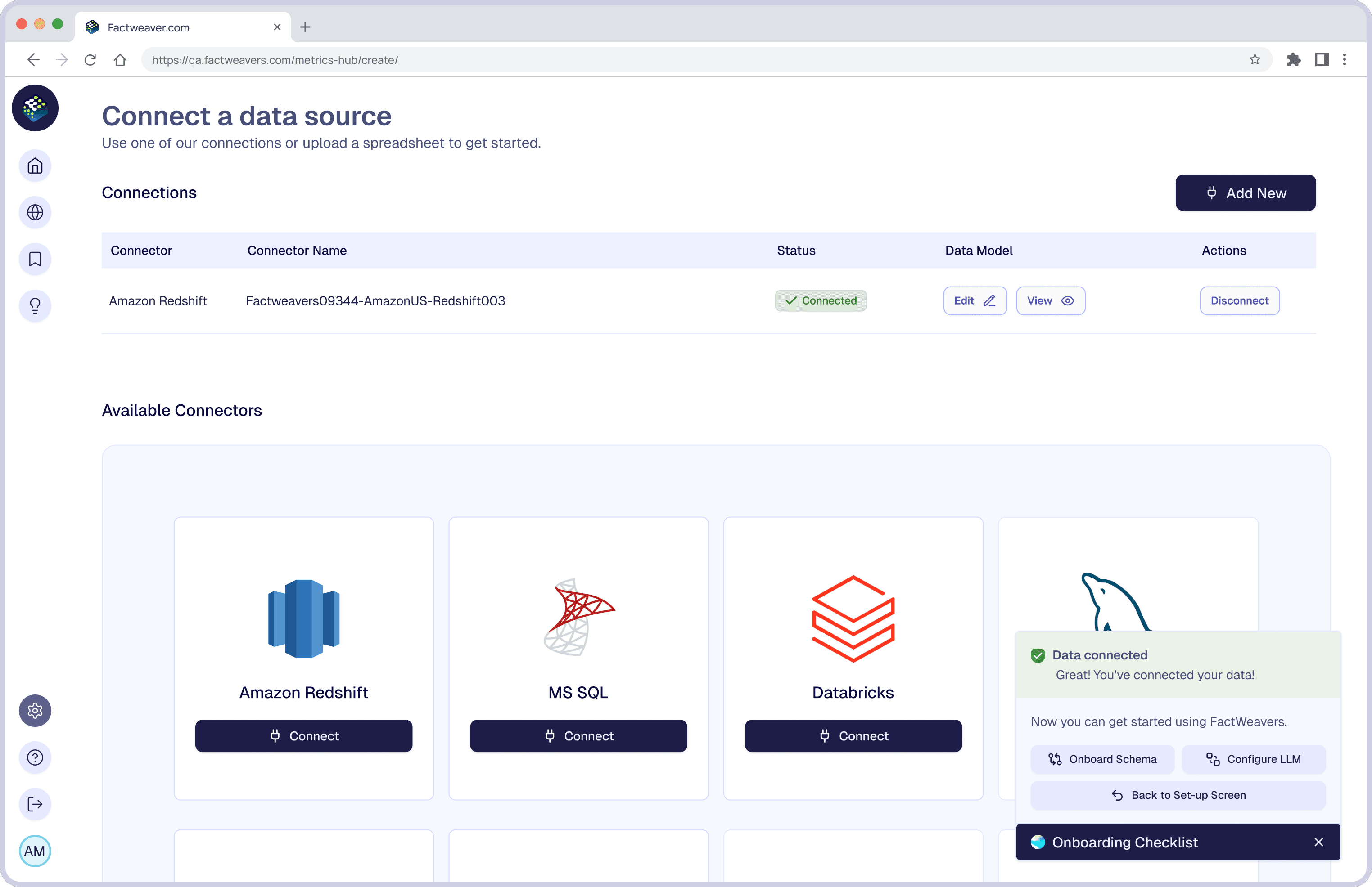
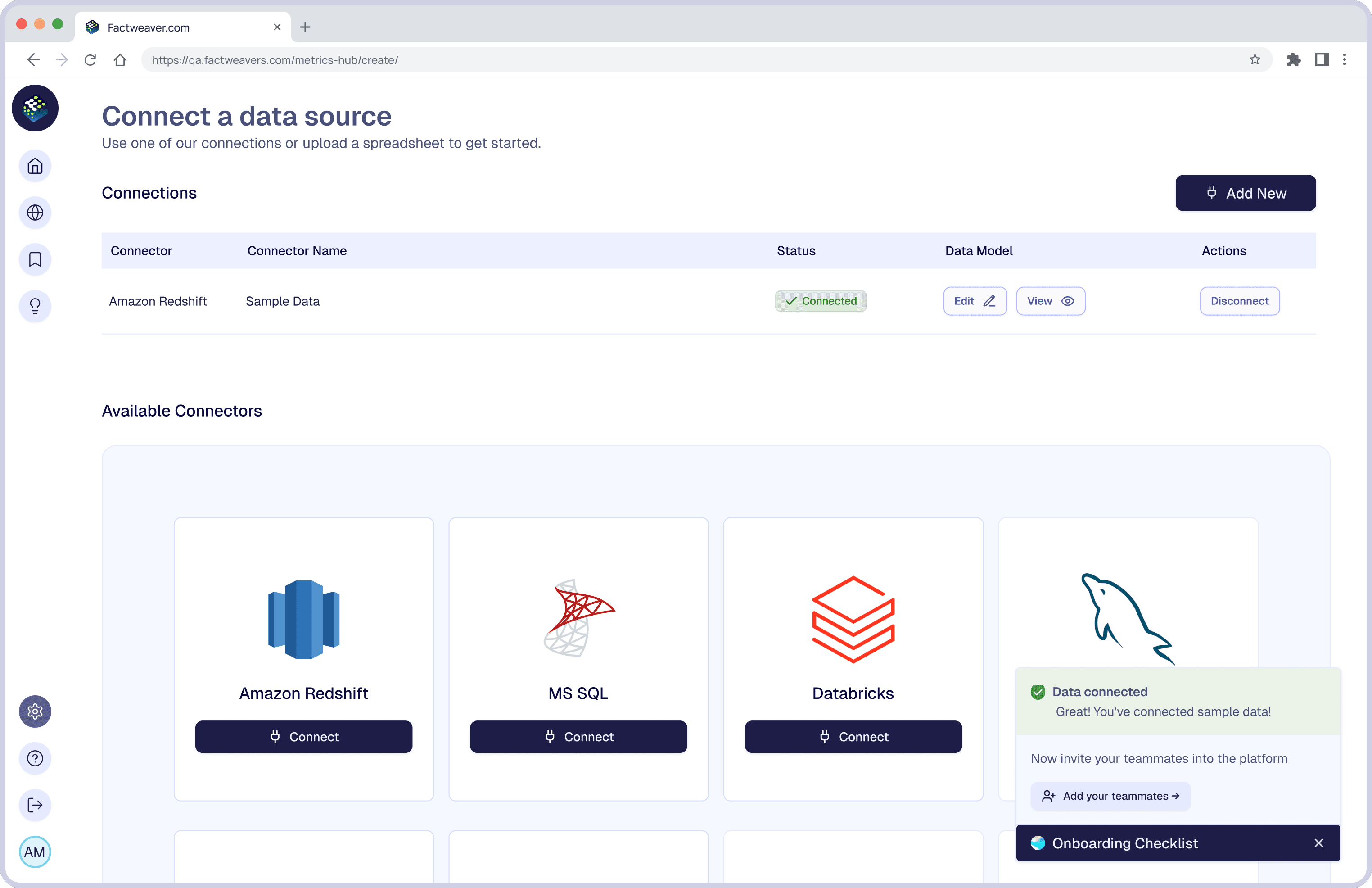
The existing onboarding was fragmented and technically oriented, creating friction for business stakeholders. I redesigned it as a role-aware, guided system that adapts based on user context.
A behavioral layer, not a visual one
Structured across three interconnected layers: components, role-based behavior, and visualization working together to enable scalable, AI-driven experiences.
Data-carrying primitives; cards, inputs, controls built to hold metrics, AI output, and interactive states within one consistent shell.
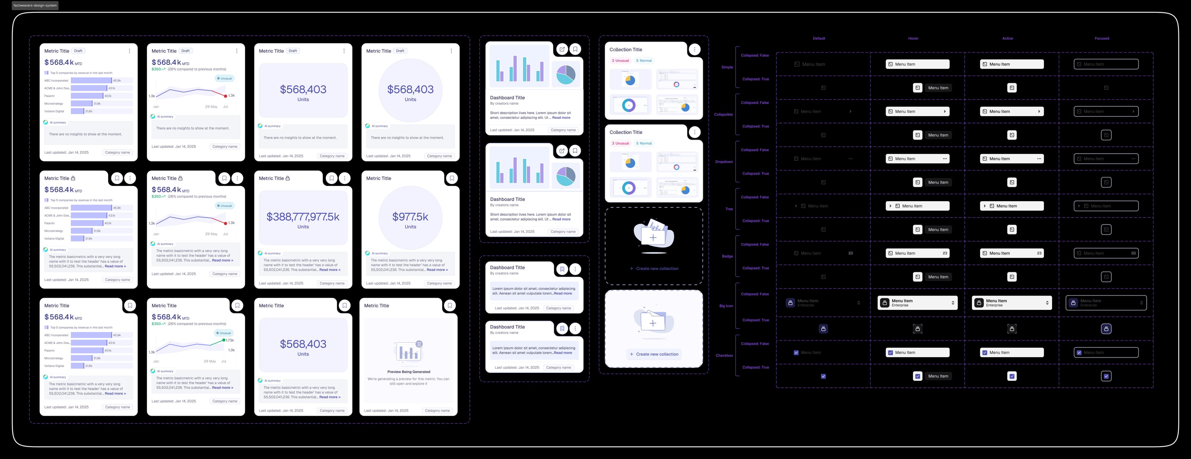
- One shell resolved once, cutting repeated design effort across three major surfaces
- AI summary as a composable slot let engineering ship new AI-powered card variants without a design dependency
- Reduced new metric type implementation from multi-week design cycles to configuration decisions
Component behavior, action visibility, and information depth adapt by role, each persona sees exactly what they need, with no interface clutter.
| Capability | Viewer | BI user | Admin |
|---|---|---|---|
| View dashboards | ✓ | ✓ | ✓ |
| Create metrics | – | ✓ | ✓ |
| AI exploration | – | ✓ | ✓ |
| Manage permissions | – | – | ✓ |
Key design decision: the access model is reflected in the UI, not just backend logic. Role-awareness is a first-class system constraint, not a post-launch patch.
- One adaptive system served three distinct personas, no duplicate interfaces, no parallel design tracks
- Surfacing the access model in the UI (not just backend logic) reduced onboarding confusion and support escalation
- Role-conditional rendering meant new features automatically inherited correct access behavior
A constrained set of chart types, readable at card scale and expandable to full screen, each mapped to a specific analytical intent.
- Constraining chart types to analytical intent prevented visualization sprawl and reduced misinterpretation
- Anomaly as a first-class data state meant engineers inherited exception handling from the system
- Same component served card-level scanning and deep analytical exploration, zero parallel implementations
Five tensions I designed through
Simplicity vs. flexibility
Simplified interfaces reduced onboarding friction but limited advanced use cases. I addressed this with progressive disclosure, guided workflows that unlock deeper configuration as needed.
AI automation vs. user control
Full automation accelerated workflows but reduced trust in high-stakes scenarios. I positioned AI as collaborative; offering suggestions and explainability while keeping users in control of final outputs.
Standardization vs. customization
Strict standardization limited adaptability. I introduced reusable components combined with configurable filters and metrics, balancing consistency with flexibility.
Guided experience vs. exploratory freedom
Guided flows improved onboarding but constrained experienced users. Entry points now transition from structured guidance to open-ended exploration.
Performance vs. real-time interaction
Real-time interaction introduced performance constraints at scale. I prioritized perceived performance, optimized feedback loops and progressive updates over raw backend speed.
From reporting tool to decision-making system
The redesign shifted users from fragmented, developer-led workflows to a fast, self-serve decision-making system.
Product & user impact
- Reduced time to define and configure metrics through structured and AI-assisted workflows
- Enabled non-technical users to explore data independently, without relying on data teams
- Improved clarity in AI-generated insights through explainability, reasoning, sources, assumptions
- Increased decision-making confidence by allowing users to explore, refine, and compare outputs
System & design impact
- Introduced a modular architecture separating onboarding, metric definition, exploration, and visualization
- Established consistent interaction patterns across workflows, reducing cognitive load
- Created a shared system layer, design system, components, permissions to ensure scalability
- Enabled progressive disclosure of complexity, supporting both business and advanced users
Business & team impact
- Accelerated onboarding and activation by simplifying initial setup
- Reduced dependency on data teams by enabling self-serve analytics
- Improved cross-functional collaboration through clearer role-based workflows
- Positioned the platform as a decision-making tool rather than a reporting system
Designing scalable data systems means balancing flexibility with clarity across diverse user roles.
Simplifying complexity is more effective than hiding it; structured guidance is key.
AI is most valuable when it's explainable and integrated into workflows, not isolated as a feature.
Strong information architecture is foundational to scalable product experiences.
Universal AI
Conversational AI · AI-powered analytics